Author: Anirudh Bhattacharya
Exercise 2: Introducing Your Character

To begin this exercise, I chose the above thumbnail as reference for the first panel. The thumbnail is my impression of the opening shot of the Japanese animated film “Nausicaä of the Valley of the Wind” by Studio Ghibli. It is, from my research, rather commonly used shot, especially in old western films where a major character, usually a cowboy or bandit of some kind is seen approaching the camera in a wide shot.


In several places, this kind of a shot is also known as an establishing shot:
“Extreme wide shots are often used to introduce the audience to a location. In this case, they are referred to as establishing shots. Often, an establishing shot is used at the beginning of a scene to let the audience know where the ensuing action takes place.” (^1)
With that established, I proceeded to illustrate the first panel.

This first panel is of a man walking away from what appears to be some kind of a crash, a shot that establishes the situation very superficially. This gave me enough of a context to draw out the rest of the page as I had presented myself with enough questions to answer in the following panels. The questions I used as a reference for the page were along the lines of –
Who is the man? > Did he come from the crash? > If so, was he with someone? > Did they die in the crash?

(1)Unknown, Author. “Extreme Wide Shot: A Guide to Shot Sizes for Filmmakers.” Cadrage Director’s Viewfinder | App for iPhone & iPad, 7 Sept. 2022, http://www.cadrage.app/extreme-wide-shot/.
Right off the bat, I had a decent backstory to support the scene so I went with it for the time being. Since it came to me so naturally, I was able to visualise the scene in a cinematic format almost immediately, the rest was just fitting each shot into panels and figuring out the style. Initially, I thought I’d go the usual line art way with and draw the scene in detail, but with a limited scene like this, there were bound to be a limited number of elements to make in the first place, and I figured that since I had full creative control of this comic strip, I need not go the detailed route, all i needed was something just enough to convey the message. From there on out, I decided to improvise as I drew, focusing on the just the idea, and not putting too much effort into the drawing itself.
The very first panel, being in greyscale, already had a noir atmosphere and I decided to ccarry that forward. Something I’d subconsciously picked up over the years of seeing a lot of noir cartoons and comics was the use of negative space and just the colours black and white in general; especially in comics like Batman: Black & White, which I realised might have been one of the influential factors, where noir is a consistent theme throughout the collection. Here is one of the covers as an example:

So, finally, what I ended up with was a man in a suit (to go along with the noir style) walking away from what appears to be some sort of crash site in a barren land, followed by an explosion in the crash site. On a closer look at the man’s face we see him crying, perhaps grieving, perhaps he lost someone in the “crash”. Basically, I’d created enough on this one page to leave the reader with a number of questions, both about the character and the context.
Research Task: ‘ The Spirit’

For this research task, the instruction is to analyse the above image which is a page from a 1947 issue of ‘The Spirit’ with respect to the questions.
1. What does the first panel establish in terms of place and atmosphere?
– The first panel sets the scene in a house or inn on a dull, rainy day in what appears to be a desolate, run down town. A ringing sound comes from the house, adding to the eerie atmosphere.
2. How does the page progress from panel-to-panel? How does the use of sound effects inform you what is happening in each panel?
– The page progresses by closing in, panel by panel, on the source of the ringing sound, which also acts as a way to introduce certain details. The first panel introduces us, the audience, to the building and the town it is located in. It uses certain elements to introduce the title of the series “The Spirit”, like a fallen banner in the foreground, and some signs in the background. It then zooms in to the skylight of the building from where the ringing noise is emanating, below which is a swing sign with the name of a cartoonist’s studio, and some blank pages blowing in the wind, some covering the sign. The next panel changes the perspective from below the house to just above the skylight where we see a rotary dial telephone ringing inside the building and a “bang” noise, suggesting some kind of altercation that takes place in that moment. The final panel takes into the house next, revealing the reason for the telephone’s ceaseless ringing, which is that the ‘cartoonist’ lies unconscious, probably as a result of the altercation that produced the bang noise in the previous panel, with a literal paper trail leading out of his room, suggesting that it was made by the person who knocked him out. We know it is the cartoonist because the panel also shows a poster of him and the title of the issue above the doorway of the room, along with a series of framed comic strip panels hanging from the wall right next to it.
3. How is the effect of weather created and used to add atmosphere?
– The effect of weather is created by rain and the reaction of objects like paper and leaves to wind, suggesting the presence of a storm at the moment of the scene. This creates a strikingly tense and grim atmosphere for the setting.
Exercise 1: Starting a story
For this exercise, I stuck mainly to film and animation as reference. As instructed, the moment the film or animation begun, I started sketching out a thumbnail for the very first shot. Every thumbnail was the first and only version of it. The media used changed as per how much detail I thought each thumbnail required, as did the approach for each thumbnail. For example, for my first two thumbnails (right) from Casino Royale and Ghostbusters, I used the rule of thirds to more accurately compose the frame. However, I did not require it for the next two (left). Under each thumbnail I wrote a rough description of the shot, including the name of the film, the location, time of day, the context and the type of shot. For the first four shots, I used a fresh brush pen and an old, relatively dried up brush pen, the former allowing me to produce thicker patches of black, the latter to make mid-tones and soft shadows.
Casino Royale’s fixed opening shot takes place at night and is mostly dark except for the partially illuminated face of the man in the foreground (half of whose face is hidden in darkness to emphasise on the tone of mystery and the noir style) and the dimly lit buildings in the background.
Ghostbusters on the other hand is a downward panning low shot, which starts in a bright sunny sky and slowly pans downwards to reveal the entrance of a public library, thus setting an optimistic and pleasant tone and introducing us to the location.


Somewhere along the way I started to use oil pastels to introduce colour to the thumbnails.
Masaan (top row, first from the left) had a rather simple opening shot (medium shot) which provided context to the scene without overtly suggesting anything. The emphasis is on the woman who appears to be keenly but quietly watching some kind of pornography on her laptop while she sits in a relatively unlit room except for the little sunlight coming in from the doorway behind her, to perhaps emphasise on the secrecy of the action.
Rang De Basanti (top row, first from the right) starts a lot more dramatically, with a montage of shots of actions that seem to be in preparation for something. The shots are monochromatic so as to suggest historical significance. The opening shot (close-up shot tracking rightward) is of a man applying “kohl” or “kajal” around the peripheries of his eyes with his middle finger, usually something observed in Islam or even among Hindu women. The movement of the shots, which is basically a rightward tracking movement, perhaps adds a sense of time to them as the viewers move into and out of shots rather than simply cutting to and from shots. There is a tinge of yellow in the shot which may serve to set a tone of passion and energy.


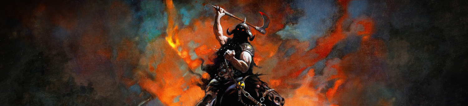
Studio Ghibli’s Nausicaä of the Valley of the Wind (top row second from the left) opens with a wide angle shot of the silhouette of a person walking towards the camera in some kind of desert grassland area amidst a sandstorm. The silhouette cutting through the sandstorm right in the middle creates a dramatic sense of mystery and scale, similar to opening shots from many Western movies, where a cowboy is riding from or towards the horizon at dawn with the sun enclosing the silhouette, which usually serves as a way to set the tone and the locational context. Here I used oil pastels as they were ideal for creating a blurring effect on paper when smudged across the frame.


The last frame I talked about, which is the opening shot from Studio Ghibli’s Nausicaä of the Valley of the Wind is the one I chose to work with for the next exercise as
1. It is composed rather simply but can be used to create a dramatic and cinematic effect due to the scale of the subject with respect to the location, scale being something I’ve wanted to play with for a while.
2. It allows me to get the ball rolling with story as a lot of details are introduced but can be further elaborated upon for the next few frames, thus giving me a lot to work with.

Assignment Two: Exploring Time & Place – ‘Four seasons in One Page’
This assignment, in my opinion, turned out to be a rather underwhelming culmination to this part of the unit. However, I think as an illustration it might (barely though) serve its purpose in distinguishing between the four seasons. My template was a simple one, slightly more geometrically stylised relative to my usual approach, which is more organic and free flowing, if I may say so myself.

I decided to keep two central elements, one that would remain relatively the same for all four seasons, i.e., the daisy in the foreground, and one that would change with every season, i.e., the tree in the background. Just to add a bit of serenity to the whole composition and to support the tree a little, I added a bench right below the tree. I also positioned the sun to consistently stay in the same position through all four seasons. This late led to my having to figure out more interesting colours for day in each season.

The first image is of spring, which basically served as the “normal” for the other three seasons, where everything is in its purest form, the green grass, a mildly sunny day, a tree with fresh leaves. The only two unchanging elements are the daisy and the bench, Honestly, the process for rendering started off somewhat as an oil painting and later changed to a more a cartoon illustration style with the addition of the outlines. I actually used a concept art brush for the rendering here, thus the more oil painting like texture. The two hardest textures here are the grass and the clouds. And although it may seem like I didn’t really end up with a very complex texture to begin with, I actually frustratedly resorted to this after multiple attempts to produce something more sophisticated.

The second image is of summer which, from my experience is obviously and firstly, is a lot warmer than spring (and the hottest of the four seasons) and a lot more humid as well. In India summer is followed by the monsoon season, which is when most rainfall happens, and as a result it’s a lot muddier and humidity in the air goes up significantly. So I tried to integrate those aspects into the illustration as well, a bit unsuccessful as I might’ve been. However, the objective was also keep the it distinct from the spring illustration so in a way this allowed me to do that. Again, I was rather unsuccessful with the grass.

The third illustration is of autumn, which is a lot cooler and drier than summer. Ironically, the colours of autumn are far warmer than those of the summer, with the grass and the leaves of the tree going drying to an brownish-orange hue. I actually ended up changing the colour of the sky to something I thought complimented the autumn colours better, something more green. Also to break the monotony of the blue sky from the first two seasons. The grass textures came out a lot better this time around.

The final illustration is of winter, which is the coldest of all seasons, both in terms of climate and colour, Everything became a lot more crystallised in this image to suggest the presence of ice. The tree no longer has leaves, and the grass is coated in a thick blanket of snow. Even the daisy undergoes a bit of shining, and while it looks a little like a fried egg, it does give it a bit of charm. The sun also looks frozen, which was done to compliment the climate. I actually don’t mind that bit. That concluded the assignment.

Exercise 3: Character Sketches
One of more exhausting exercises I’ve done, this took a decent bit of mental stamina to finish. Right off the bat I started by searching for a list of distinct professions that may allow me to a produce a variety of characters. In the end I just had to bounce between pages and even somewhat repeat some appearances. Although, the experience of the exercise did reveal a lot of things about my ability and style as I kept at it.
The first sheet:

It may not look like it but I did take my time on each individual character. However, in anticipation of fatigue I decided to keep the designs simple, and therefore. also concise. I started with the pilot which was supposed to set the foundation for the rest of the characters. As I finished it, I developed a dynamic with the process that allowed me to approach the design with a clearer method. I started with a simple line drawing but subconsciously would end up bringing out some clear anatomically accurate features, especially in the legs. Most of the appearances came from memory, few from research, since this exercise was more about the style rather than the final completed character. A lot of them were thus stereotypical because in my mind stereotypes are the best way to provide definition to a character, as generally inaccurate as they may be. An example, interestingly, would be the artist, because most artists today do no wear berets and a woollen scarf, nor do they all paint on a canvas, but those are what people usually identify as “typical artist attire”, particularly in a pop-culture context. However, I believe I might be missing something there, because I feel like if I’d done a bit more research I might’ve come up with a more modern representation for some of these ideas.

After a point I started running out of distinct professional uniforms to take inspiration from, so I started referring to historical and religious attire as reference, as well as some unusual professions like the beekeeper and the caretaker. I started notice distinct stylistic features in the characters, like square heads and giant rounded ears. Eventually, even the arms started to take a more anatomically accurate shape in some characters. There wasn’t a particular low point in terms of quality, it was more like an ongoing evolution that bring out some odd features like the feet of the policeman. And sometimes the designs were too simple, like the magician.

Finally, the comic strip was fun to make but it was also quite spontaneous, mainly because I had 40 characters to choose from and only three frames to tell a story. I finally decided to make something with the detective, and the next thing I thought of was the movie “Catch Me If You Can” with a Leonardo DiCaprio and Tom Hanks, where the former, for a decent portion of the film, fakes being a pilot and is chased by the latter who is a detective. So I decided to add a second character, and make it a suspicious pilot. The drawing part of it sorted itself out as it went.
Research Task: The ‘gag’ cartoon
Of the given artists, after a bit of browsing, I decided to go with Bernard Kliban’s work, after which I did a little more research and a decent bit of giggling, I found or rather settled on this illustration to analyse:

Now for the questions.
1. What is it about their style you like?
There isn’t anything particularly striking about the artist’s style, it seems to be a rather ordinary illustration style when compared to the other artists on the list or cartoonists of that era. However, the compositions of the majority of his work, including this one, are simple, both in terms of detail and colour, and the message comes through efficiently despite or perhaps even because of that.
2. Is the cartoon silent or does it include words?
The cartoon isn’t silent but it doesn’t have many words either, and the only piece of dialogue does a brilliant and almost instantaneous job of evoking a strong sense of relatability despite the stark contrast between the contexts of the subjects and the audience.
3. What is the subject?
The subject is an interaction between two cavemen taking a stroll, both holding sticks, as per the idea that caveman equipped themselves with sticks to use as tools or weapons, being the most primitive form of man; the comic is basically about one caveman telling the other that he’s thinking of getting a new stick.
4. What is it that makes the joke funny?
What makes the joke funny is that while the the idea of wanting something new is relatable even today (especially today), the fact that the caveman wants a new stick is absurd, and yet understandable when seen from his perspective. I believe that mix of emotions is what makes this illustration amusing.
Exercise 2: Turning Pictures into Words
For this exercise, I chose the first image because I found it the most challenging. Consequently, as per my tendencies, I am not confident I will make a good enough guess as to what it is either, however, I shall give it my best shot.

The Brief: The illustration you have to produce takes place in a scientific research facility. Consider a scene where, in this research facility at the end of the day, everybody’s left for the day and the cleaning lady is busy mopping the floor, with a bucket close by. Right next to her is a control panel of sorts, which is a basically a big box about 3m tall and 10m wide, with lots of buttons, tapes, lights, analogue meters, switches and speakers; also include an extruding desk with a reading light above it and chair in front of it. Essentially, through a small doorway, from within the box, show a shrunken man walking out with his briefcase to leave for the day; the maid turns towards him, staring in amazement.
Again, I’m not sure how well I did, but hopefully I have given the artist a good enough description to engage in some research and produce the illustration.
Exercise 1: Wordplay
I took a slightly unorthodox (at least in my opinion) approach to the story of this comic strip. The reference for the same was a group chat on Instagram that I am a part of, and once in a while I’d notice some absolutely ridiculous interactions and conversations. One such instance was when a friend of mine had two profiles of his on the group chat at the same time, essentially being able to text from two separate IDs. Once in a while I’d catch him narrating a story on the group (with one Instagram ID) based on something that happened to him in college, and at the bottom of the screen, notice he’s reading his own narration of the story (with another Instagram ID). I found it quite striking that this even happened; essentially I saw no point in having two IDs on the same group if you’re just going to use one to read messages written by the other. And so I made a comic strip metaphorically expressing that interaction through actual characters instead of Instagram IDs.
The first version, that used nothing but dialogue, was pretty basic and only uses dialogues in two of the total four frames. It basically showed an interaction between five characters, including my friend Kartik, his other ID counterpart, two other friends and I. It starts with Kartik narrating his story to three people (including himself) in the first frame, me appearing in the second frame absolutely depressed by the sight of it, Kartik noticing my presence in the third frame (this wouldn’t happen in a group chat obviously, this bit is fiction), and explaining himself in the fourth. The reason the other two aren’t engaging in the conversation between Kartik and I is because they haven’t even noticed it happening. As for the production of the strip, all I used was ink pen brush in photoshop on an A3 size canvas. I organised the layers such that the illustrations were at the bottom, the speech bubbles and boxes in the middle, and the panel lines right on top.

The second one, like the others to follow, saw a slight change in the narrative because of the adaptation of the script into a narration. It also lacked the sarcastic tone born of the silence of the first one. The tricky part is understanding how the words will fit into the space without seeming crammed or overlapping with the illustration. If I may say so, I don’t believe I did the best job of it either, the end product seemed inconsistent, although readable.

The third was easier to articulate because I narrating it from my own perspective, having a character based on myself in the strip. Along with another slight change in the narrative because of the change in style, this also had the most written content and also had its own kind of humour, different as it might be from the original. I also did a better job of text placement in this one.

The fourth and final version, which had a mix of all three, as suggested, served as a collage of the other three, in addition to a few extra bubbles and boxes. Understanding how to coordinate between the narrator, the third person narration and the dialogue was a bit tricky, and again, not as successful as I’d have wanted it to be. However, I managed to add a bit of humour at the end of this one, hopefully enough to save it.

Exercise 3: Drawing a Grid | Exercise 4: Filling a Page

I created the grid on an A3 size sheet and was surprised to find I could still use a ruler fairly easily, which is not so much an observation as much as it is a remark. The actual exercise, which came next, I did not want to continue on the sheet of paper, having only a rough idea of what I wanted to make and realising I might waste a lot of time and paper figuring out how to go about illustrating them efficiently, so I switched to Photoshop for the fourth exercise.

I also realised, much to my horror, that I took longer to draw a grid on photoshop than I did on paper. Nonetheless, I managed to make one. The place I chose to draw around was, after much consideration and thought, my grandfather’s museum, which contained the life and history of the local deity and other deities in the Hindu religion. I’d been there very often as a child, and I basically knew my way around it like the back of my hand. Still, recreating those moments and sights would be a challenge; after all, a child may notice details but not necessarily specific scenes from his memories. It isn’t very well documented either, there aren’t many photographs of it on the internet, so that sort of worked to my advantage, gave me the challenge I was looking for.

Box 1 was basically a series of exhibits representing the local deity in various stages of his life. Not particularly extraordinary but it stayed on as one of the most vivid memories I have of the museum.
Box 2 Is an image of my grandfather and I praying to the Elephant God Ganesh, something he religiously did and had me do every day we went to the museum.
Box 3 is an image of the museum cinema hall, where they’d run films produced and written by my grandfather about the values of God.
Box 4 was another installation, a dynamic one with a particularly fascinating gear mechanism that I never forgot. It basically had children walking in circles around a statue of the monkey God Hanuman, who eventually emerges in the flesh from the ground after the children have circled the statue a certain number of times. According to my grandfather, this was one of the trickiest installations he’d ever had to produce.
Box 5 was the office where my grandfather and his staff would do most of their work which involved a lot of paperwork and sending a lot of emails. Another thing I never forgot.
Box 6 was this S-shaped walkway in a particular section of the museum, on the side of which was beautiful miniature model of a Buddhist temple in Tibet. It always got a lot of attention particularly because it was coated in gold or something similar in appearance.
Box 7 was another very vivid installation, which was basically a recreation of an event in Hindu mythology, where the Lion God Narsimha broke out of a pillar in defence of a young child whose father threatened to kill him over his faith in the God. Of course, the story was a little more complicated than that, but the lion suddenly popping out of a pillar always caught passersby off guard, you’d often hear a yelp or two from that section of the museum.
Box 8 was the biggest and only outdoor exhibit. I wasn’t completely sure how to illustrate it, but I think the subject of the scene would be the people reacting to the exhibit. It was basically a pond or tank of sorts with at least a thousand koi fish, with a bridge running right through the middle of it. Of course, this school had grown over several decades of care, and rather systematically, everyday at 10 a.m. and 4 p.m. my grandfather would feed the fish amidst his busy schedule as the director.

I was actually confused as to how increase the level of detail in these images considering I didn’t want to waste much time. I then remembered my approach towards creating storyboards which was basically just adding a rough idea of the lighting which usually elevates the image severalfold, and so I decided to go ahead with that. I added words and expressive punctuation for that punch comic strips have. I used dramatic lighting to direct attention to the subjects in each box. The only box I wasn’t able to effectively elevate was the last one although it does have a bit of a comic effect.
