This time I actually started with some research. Initially menu cards from a general category of “High class European coastside restaurants” or “European fish restaurants”. What I ended up with was nothing short of expected, nevertheless it did serve as a reminder of what kind of a mood and theme I had to match my work with.
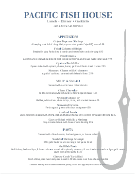
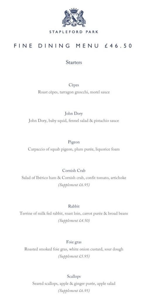
What did kill the mood a little was the fact that they all restricted their colour to a cream / slightly off-white / white background with a shade of blue and/or black for the details, including the logo. Moreover, literally all of them (from the ones I found) primarily used a serif font. Except for perhaps in the title. And while that isn’t that significant a detail with regard to the exercise, I wanted to design something that would go with a sans serif font, mainly because it would make the menu a lot less overwhelming to look at, unlike the serif. Although, the more visually balanced written content does add elegance, e.g., the menu on the far right, but the alignment does not serve it well. Also many of them keep the use of illustrations minimal, taking up less than 10% of the space. I assumed at some point that I should have been looking at more exciting menus. Then again, a client is a client, in reality I wouldn’t have much of choice and all this analysis would have gone to waste.
Now came the part I least looked forward to, the mind map. While it does serve a relevant purpose, without going all out with the branching it tends to look incomplete, dare I say I wouldn’t have much to work with. In simpler words, I find making mind maps to be “overkill”, in the process.
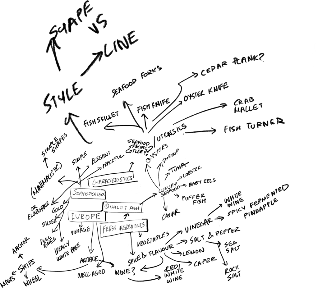
If you’re wondering why the scale is going haywire in some parts, i.e., why some parts seem bolder and bigger, it’s because I start normally, and keep reducing the size of the map to accomodate more information in the canvas as it comes to me. It is a bit of an impulsive process, but it isn’t all that incoveninent.
So I actually took a more organised approach this time, creating roots from keywords in the exercise description. Europe was perhaps the most concerningly vague part of this whole thing, because I wasn’t sure whether it was right of me to assume that all of Europe experienced a uniform aesthetic prevelance. I’d studied art history not too ago, and remember coming to the conclusion that the evolution of art and the aesthetic style in europe was largely inclusive of most European countries, even though some countries like Italy, France, Austria, Spain and Denmark were a lot more prominent in this… journey, so to say.
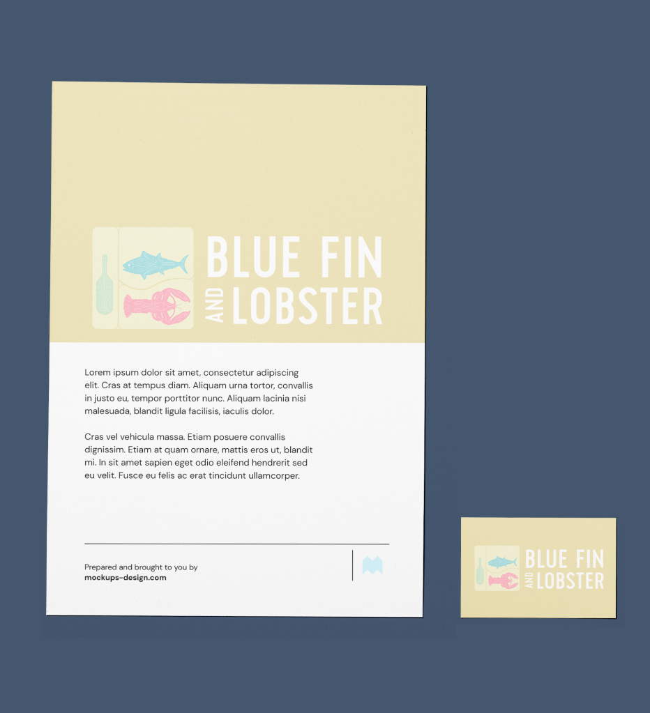
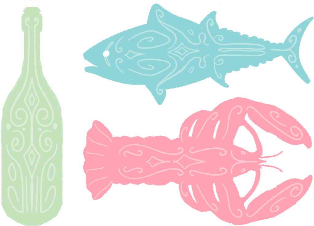
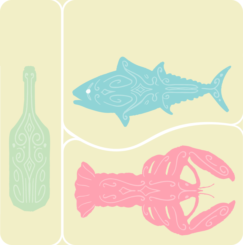
But to start with I derived my “origin point” from the food itself rather than aesthetic of the region. Particularly the bluefin tuna, which I used to create iterations and understand what style to settle with.
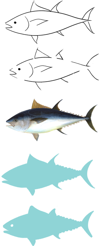
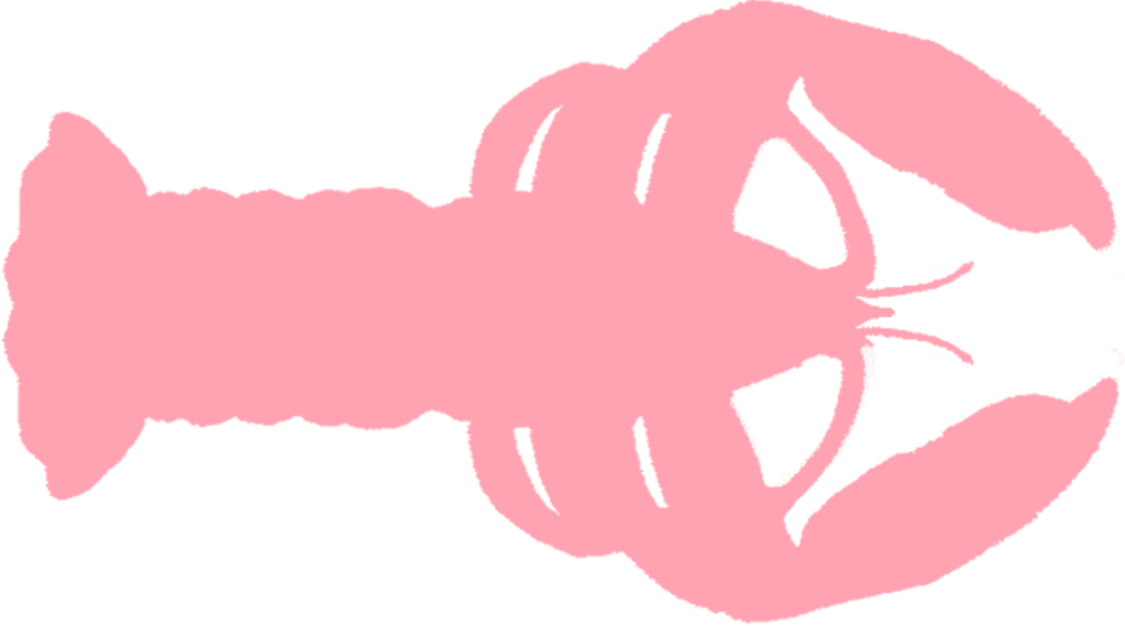
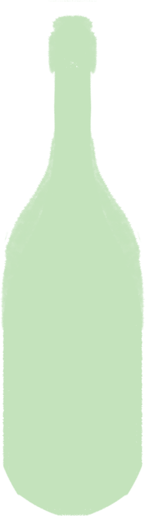
I started with simple line art, nothing all that exciting, and tried reducing the line work, cutting the lines enough to express the fish with as few lines as possible, but that didn’t really appeal to me either. So I decided to go the other way and just remove line altogether and focus on the shape. That worked better I believe, and too add a bit more stylisation I curved the fins, since I already had a lot of curved parts. I applied the same process to a lobster. And finally made the silhouette of a wine bottle. I wanted to make it something easily recognisable but still retain that sense of luxury.
Finally, the more direct aesthetic element i.e., the elegant rococco style line art. But “minimalistic” : low opacity white, not as elaborate and not as connected.
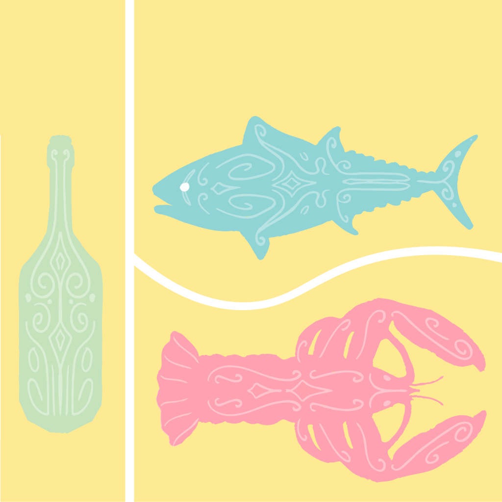
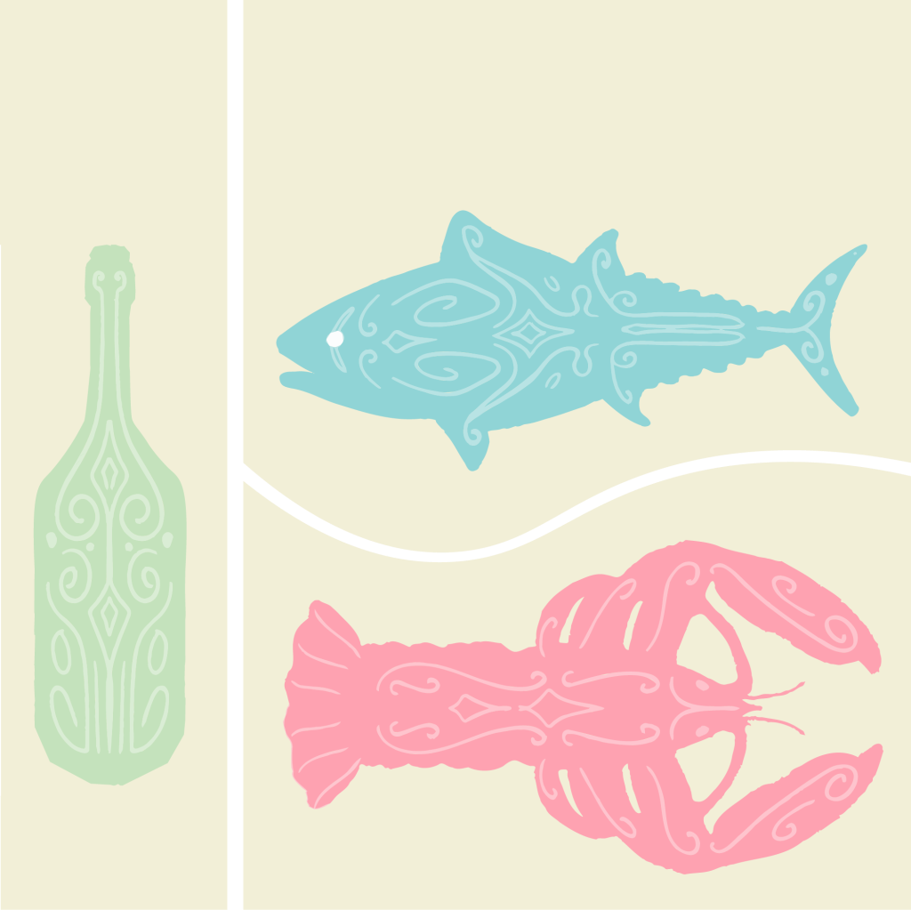
And then I vectorised the illustration on illustrator so it could be adjusted for multiple resolutions. And added a background to it to give it a more icon/logo-like appearance. Starting with a yellow block divided into three parts, then reducing the saturation of the yellow, and then curving the edges of the block and filling up the resulting gaps.
Below is a stationery mock-up for the restaurant including a sheet of paper and a business card.