
I started by creating a mind map around the topic for the greeting card, i.e., my interests and inspirations. I then researched various greeting card formats and images, and even book covers. Following this, a rough image of the illustration for the cover was created, and was then reproduced it digitally.


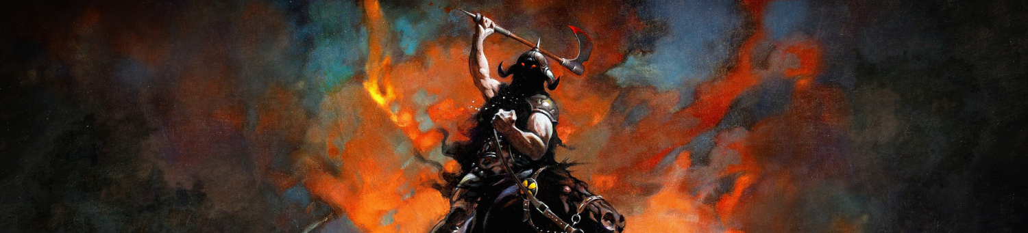
The inspiration for the style came from my idol, Master Kim Jung Gi, a Korean draftsman who produces his work spontaneously using human figures and extremely complex machine drawings in almost any perspective, but usually in the 4-point type. His style is especially impressive because of the level of proficiency it requires to be wielded so freely, not just in terms of anatomy and mechanical drawing, but in terms of the perception and understanding of space.

Youtube.com. 2020. Kim Jung Gi – The Art of Storytelling. [online] Available at: <https://www.youtube.com/watch?v=U03plcNji4w> [Accessed 24 March 2021].
The illustration included various recreations of myself indulging in my favorite activities, some literally and some figuratively; it didn’t use any complex guidelines, nor did it require as many strokes as an ordinary illustration, staying true to the execution of the style. The digital artwork was then converted into a PNG format, and the rest of the greeting card was produced on Adobe InDesign in an A5 size greeting-card format.

A bold Futura font was used for the title “Nice to Meet You” on the front page of the card, as well as for the title and subtitle for the inside, maintaining a border of a little less than 2 inches so as to avoid any confusion in the size of the bleed of the page while printing it. The front page title was made large enough to fit the entire page and placed right on top of the illustration, but with reduced opacity so as to maintain the continuity of the illustration from behind the text.
Finally the font “Helvetica Now” was used for the body text as opposed to the large and bold “Futura”, to maintain some form of hierarchy in the layout. I played around with the leading and kerning as well, just in case the words seemed too crammed and sickening to read. I used a dark grey background and white text to create contrast, with varying opacity in each section, just to establish the difference in emphasis. Interests were divided into points, each point in a different color to emphasize on the variety.
